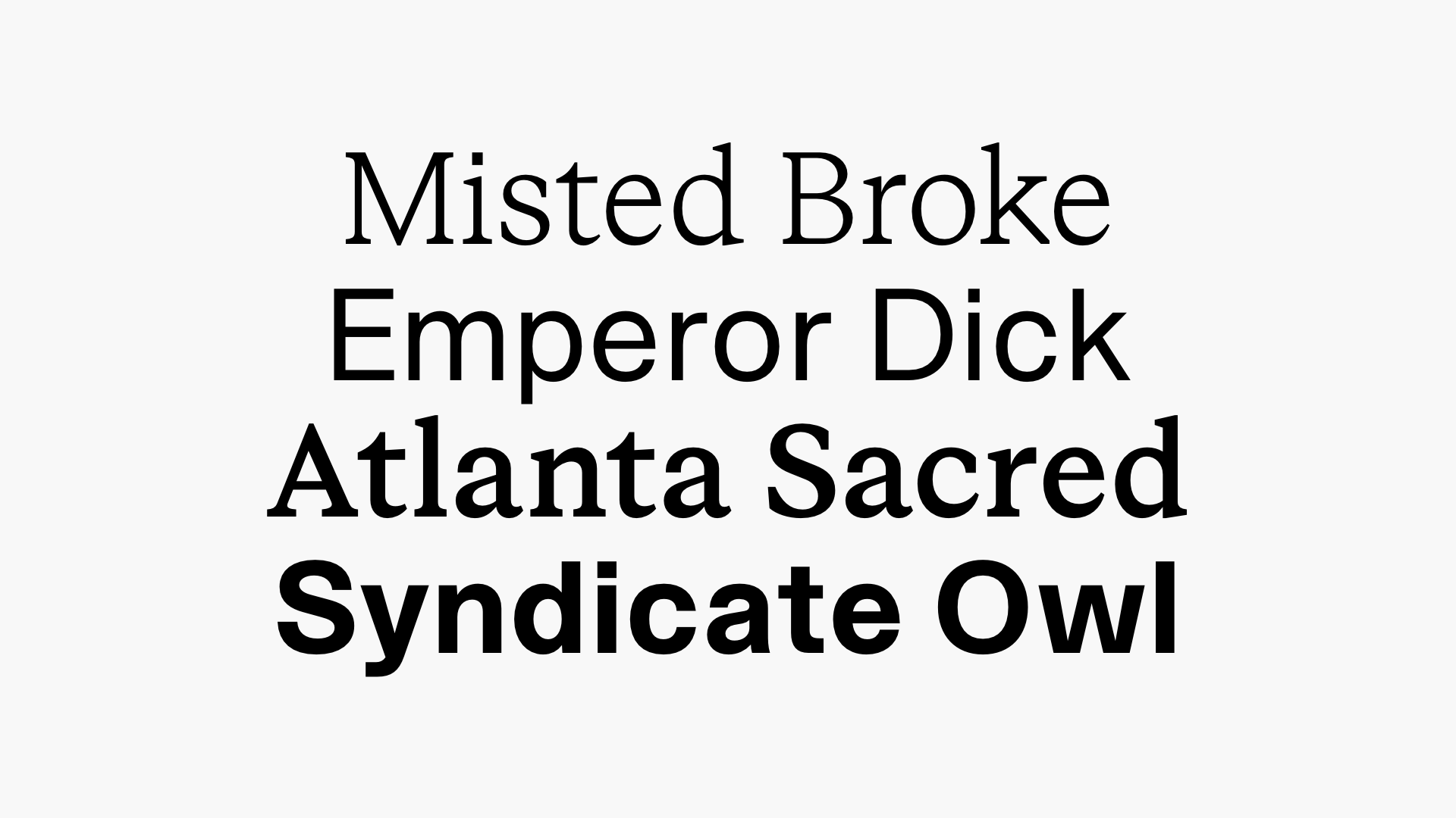
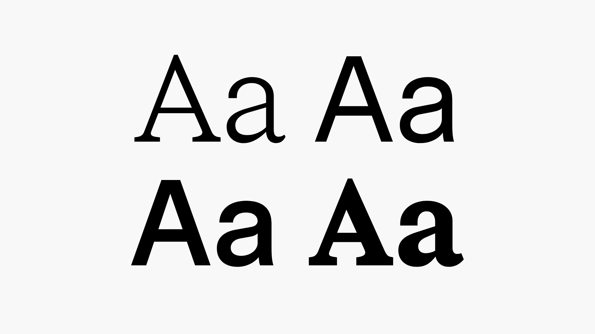
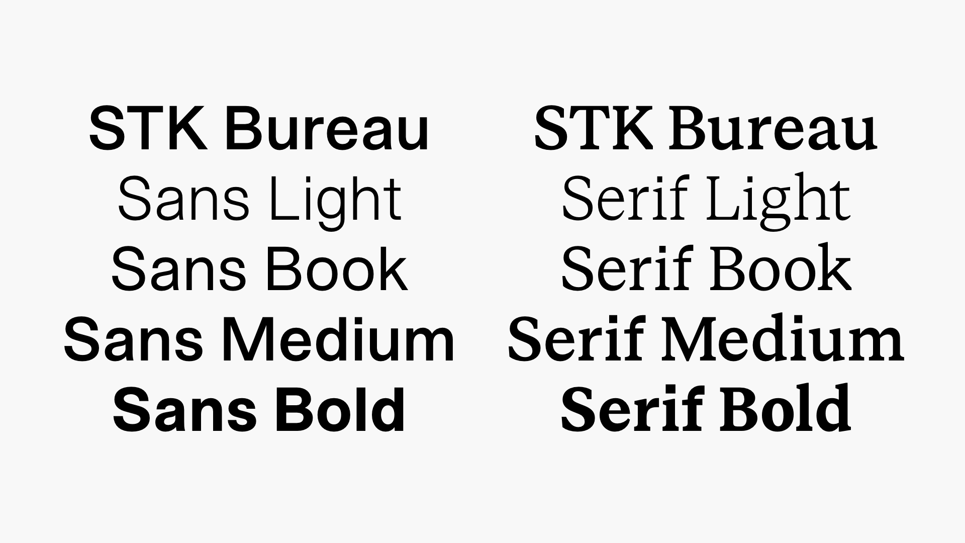
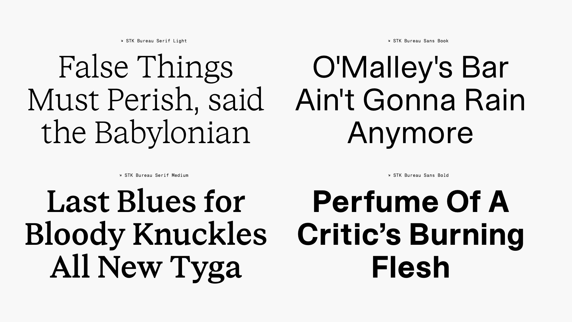
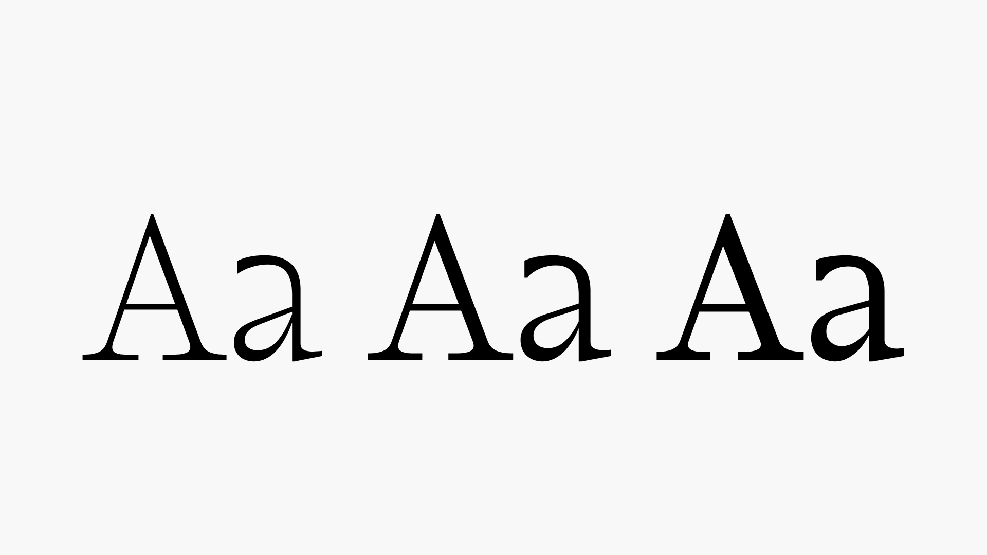
STK Bureau
Bureau is a cross-genre sans and serif type family. Stylistically the families lend from modern giants and idols, while firmly establishing an identity within their boundaries and language. STK Bureau comes in 2 styles (Sans + Serif), with four matching weights (Light, Book, Medium, Bold). The two styles can intertwine across applications because of its matching skeleton. Bureau is a workhorse, yet strongwilled – like the stallion in 'Spirit’ (Dreamworks, 2002).↓ Download PDF Specimen
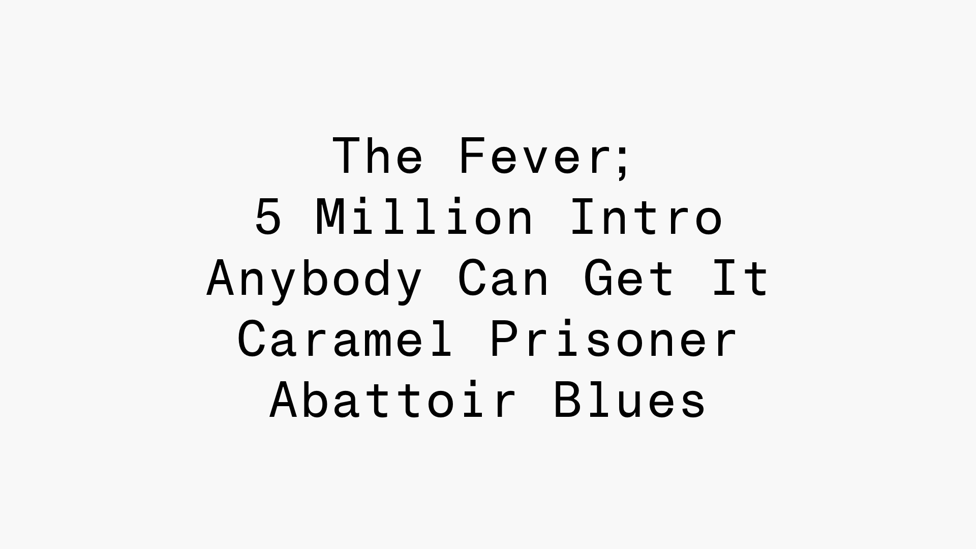


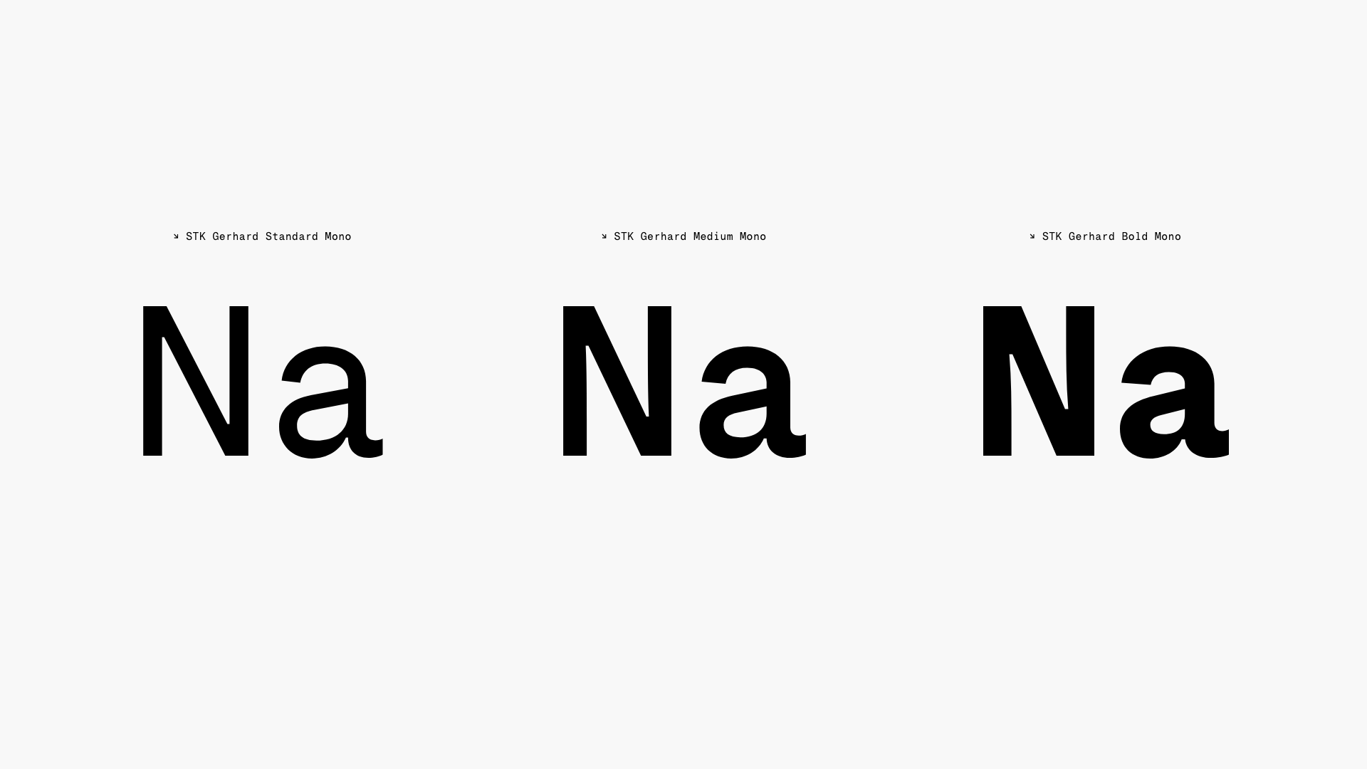
STK Gerhard
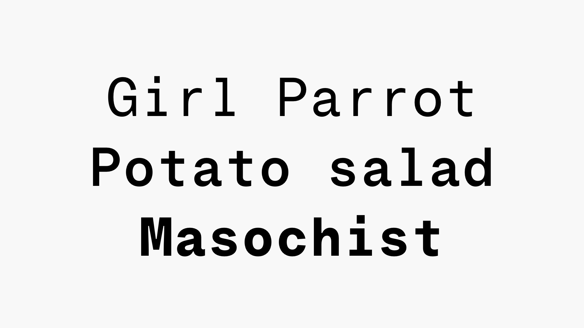
Gerhard is a mono-spaced typeface currently under development. The idea behind Gerhard is to make a no-bullshit monotype family ranging from ‘Standard’ to a ‘Bold’ cut. Inserting slits in the joints increases the letter shapes' legibility and construction language. Work in progress. All purchases and downloads will get access to the final version of Gerhard.
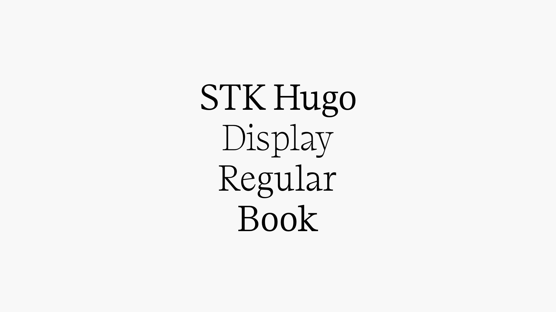
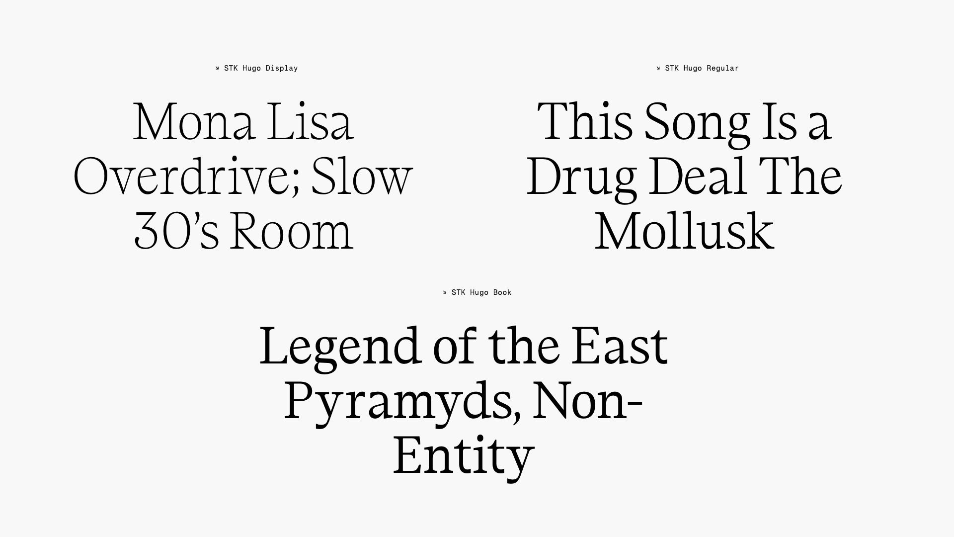

STK Hugo
Hugo is a new typeface based on traditional antiquas, and it gets its personality from its exaggerated serifs and the letter shapes' links and terminals. The character varies distinctively through the weights. Hugo acts as a dramatized antiqua with contemporary features in the display cut, best suited for modern usage. 'Hugo Book' is the rational counterpart to the 'Display' cut. With traits and qualities that ensure comfortable reading and delivery on a high functional level. In between sits the 'Regular' cut that borrows from both – a flamboyant pragmatic, you dare say.↓ Download PDF Specimen
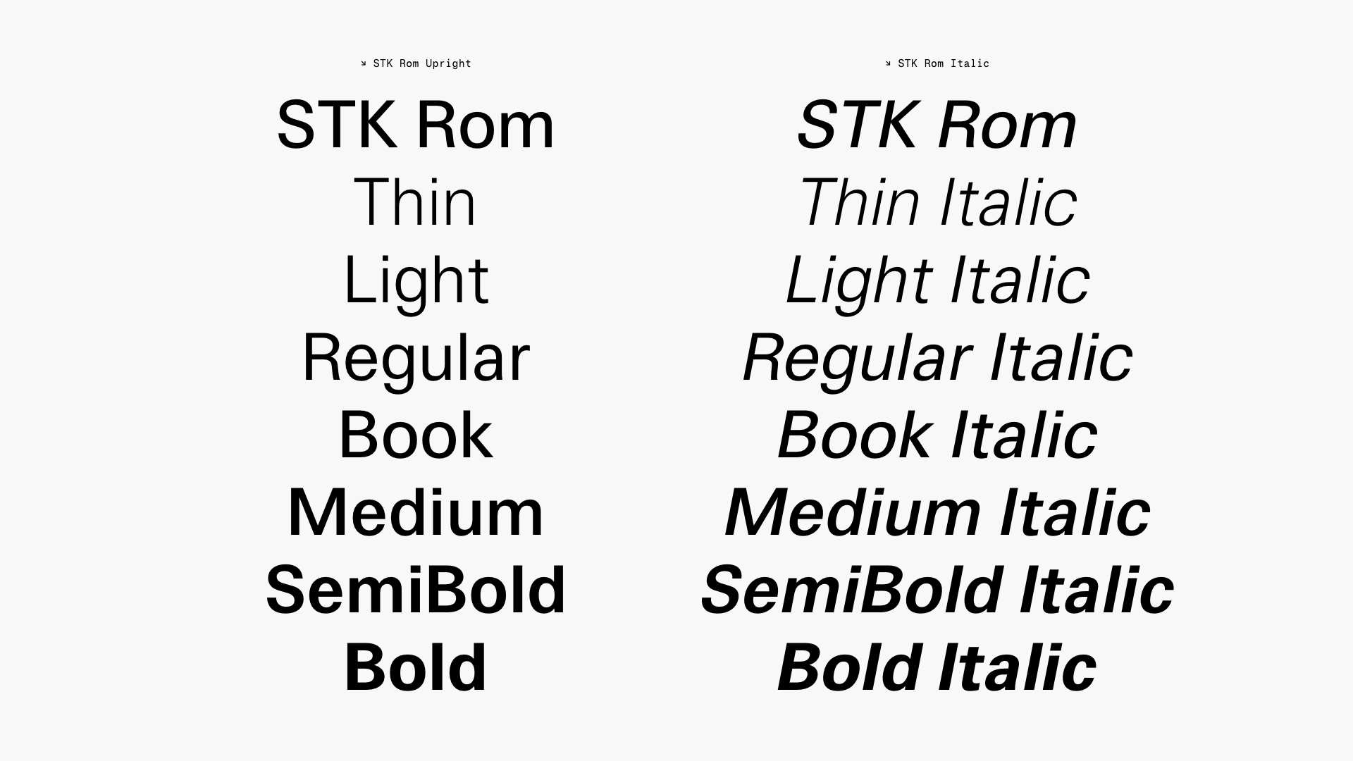


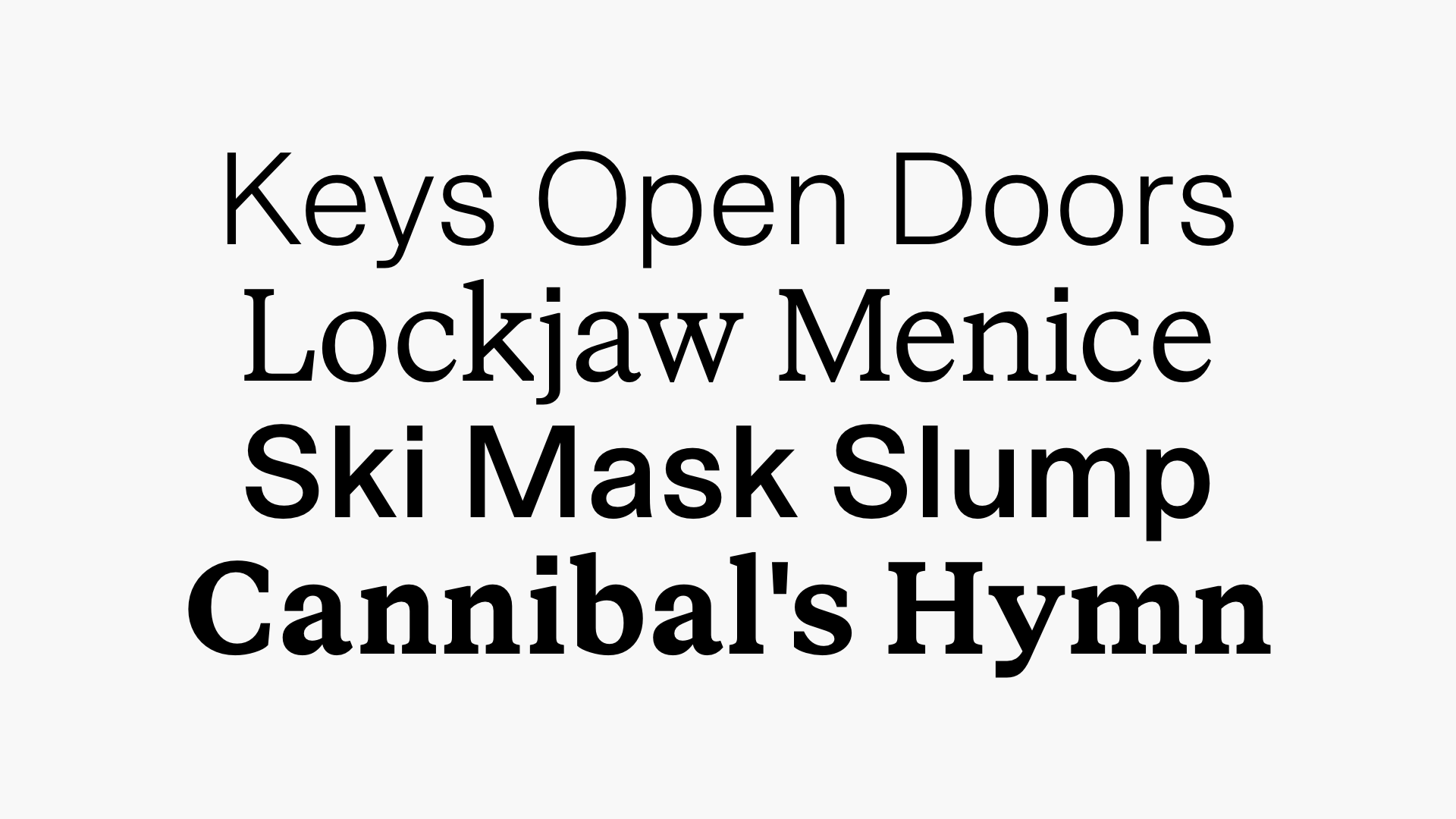
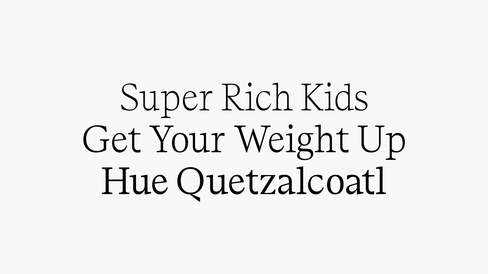
STK Rom
Rom is a typeface drawn in the spirits of Univers, designed by Adrian Frutiger. The project started as a revival – but evolved into an exercise of controlling the temperament, yet keeping the apparent contrast and character known from Univers. The project resulted in a versatile family suited for editorial use and complex typesetting.↓ Download PDF Specimen